Monday, April 7, 2014

 Rebrand that caught my eye 

It's been months since my last post. My creative life often gets put on hold for lazing in the sun. This past summer I got to experience my NEW favourite place, Fiji. Kindness, warmth, beauty and happiness - A holiday we'll never forget. On my travels I noticed Fiji Airways went through a recent rebrand, which I love.. check it out! 

Here's a little info behind the story: 
FutureBrand partnered with Air Pacific and locally renowned Masi artist Makereta Matemosi to create the identity for ‘Fiji Airways’. Makereta created a traditional Fijian Masi for the airline, which is celebrated in the airline’s new identity and translated into its new livery design. 
The team also helped design the new cabin interiors of the new ‘Fiji Airways’ A330 aircraft which have Makereta’s Masi motifs embedded in the details.
FutureBrand collaborated with typographer Kris Sowersby to create a custom all-capitals font named ‘Bula’ (the Fijian word for ‘hello’). The font was inspired by the hand-cut geometric quality of Fijian Masi, the motif print textures and the diamond at the centre of the Teteva symbol.


Monday, November 4, 2013

 I'm in love 
Nothing gets better then the combining my love No.1 Design and my love No.2 Chocolate. Mast Brothers Chocolate does exactly that! 
I'm not sure if i'm more in love with the patterns or the flavours themselves. These gorgeous chocolate bars are designed and created in Brooklyn, New York and are simply amazing. 
Check them out http://mastbrothers.com


Monday, June 3, 2013

 Paper in it's finest form 

It's been a while but at least this post is worth your wait! 
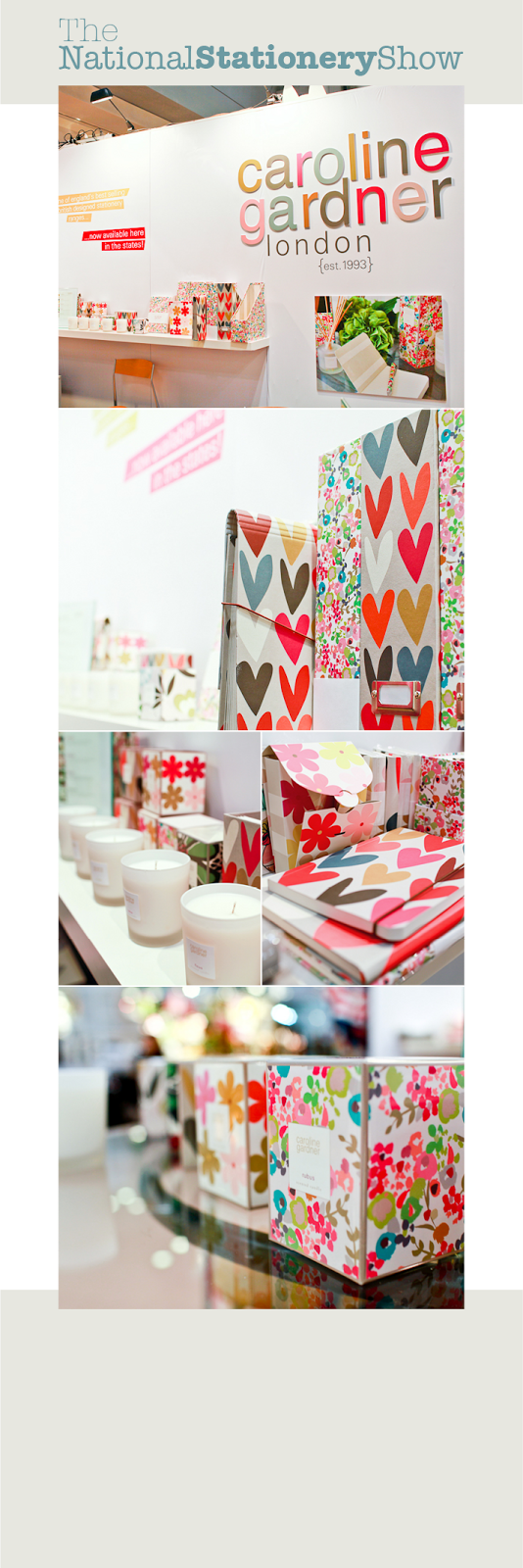
The National Stationery Show located in NYC, is an impressive display of beautifully designed paper products. I love flicking through the pics and choosing the stalls I love most.
These are my fav four: 
Rifle Paper co + Caroline Gardner + Chewing the Cud + Smock. 


Tuesday, January 15, 2013


 Eatable Identity 

Bonnard is a Mexican french-inspired tea and confectionary shop. 

The brand's distinct brush strokes and color selection are based on Pierre Bonnard's postimpressionist paintings. The simple art direction, together with french words and phonetics round up the brand's gallic concept effortlessly, spontaneously and efficiently. 


Monday, January 7, 2013

summer survival

On a 40 deg day in Sydney today.. Only one thing is necessary.. GELATO! 


Friday, January 4, 2013

 a love for stationery 

One day I hope to have a gorgeous stationery range like this.


 surface pattern designer 

How beautiful & simplistic are these designs!